Designing OpenCharity to convert dormant public data into a donor's starting point
The data existed. Nobody wanted to look at it.
The Charity Commission has published financial data on every registered UK charity for years. The API is public, documented, and free. The bottleneck was never access; it was the design. Accessible-but-boring is, in an attention economy, functionally the same as hidden.
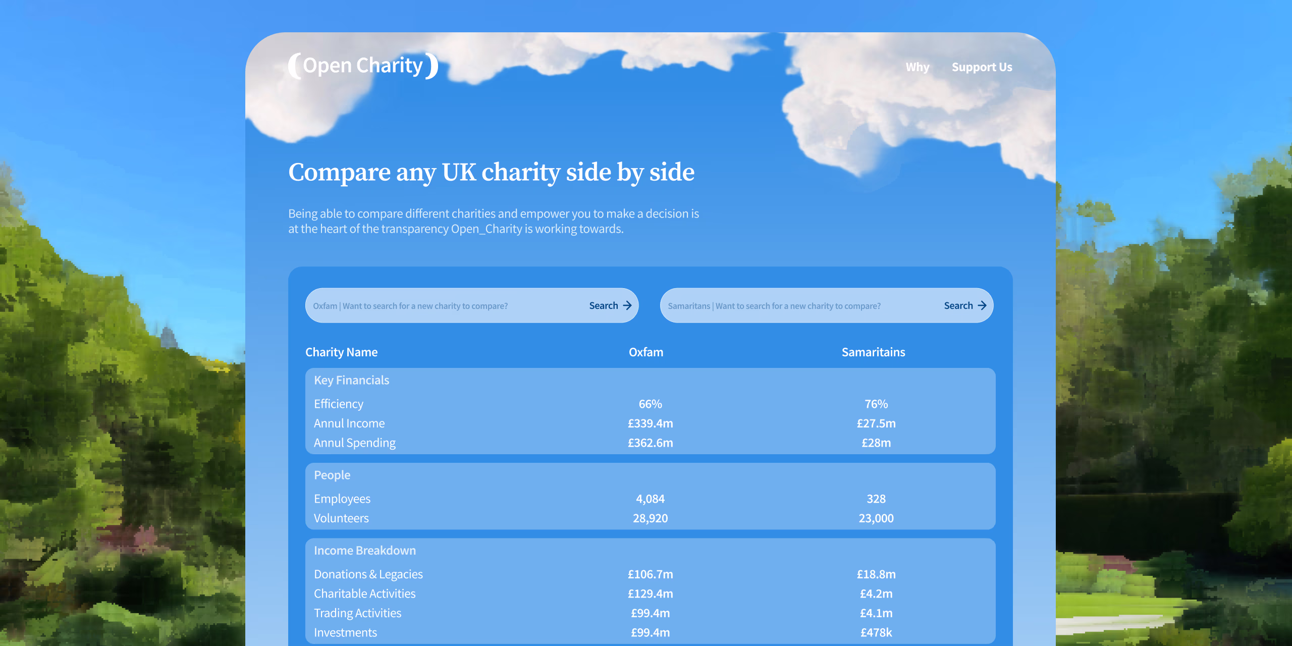
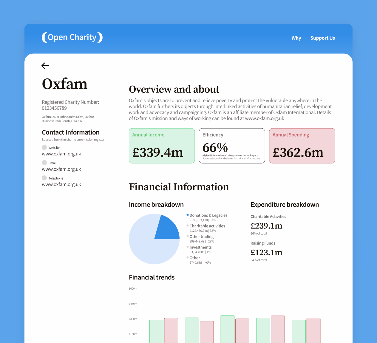
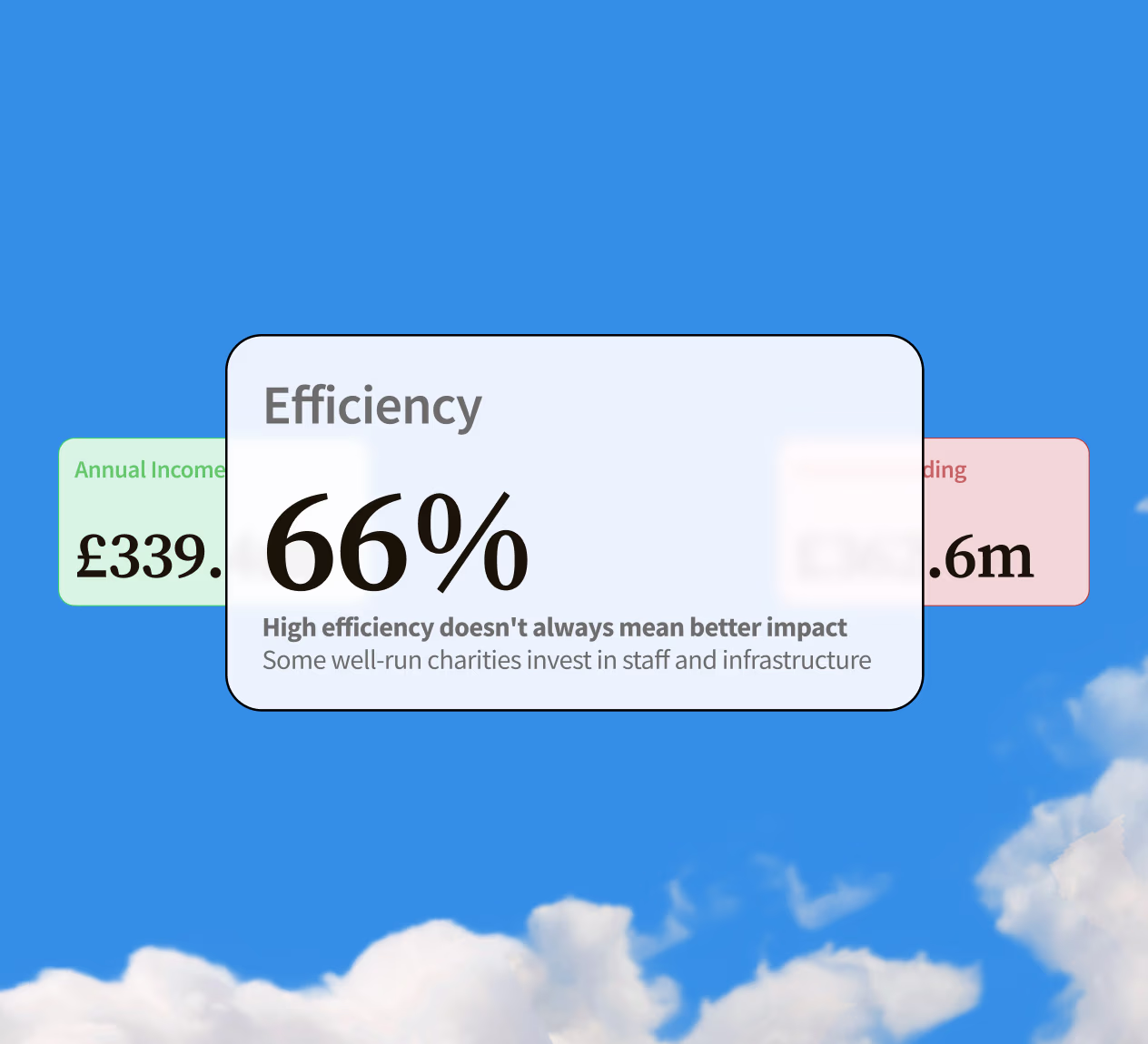
The efficiency score was the hero metric. And a contested one.
Donors instinctively want to know what percentage of their £100 reaches the cause. That number exists in the API and it is what people look for. It is also a metric the charity sector has spent a decade trying to retire, because charities that look lean on paper often produce worse outcomes than well-resourced ones. The design job was to lead with the number donors reach for, while framing it so it could not be read as a verdict.
The first iteration was a government website with better colours.
The charity detail page started information-dense: every data point surfaced at equal weight, structured like a registry rather than a story. The problem became obvious immediately. Moving from a dense data layout to pull-out cards and visualisations meant shifting from presenting data to constructing a narrative. The moment you decide which numbers become headline cards, you are editorialising. Owning that, rather than pretending hierarchy is neutral, was the real design decision.
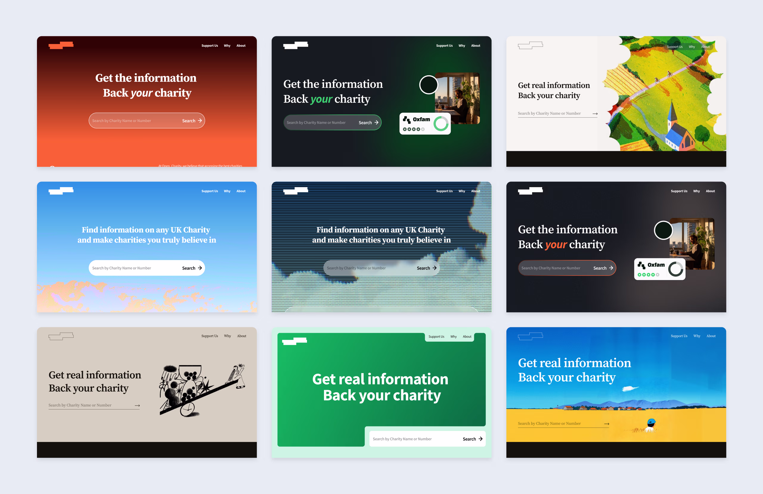

LLMs produce design cheaply. The new discipline is restraint.
The first landing page the model generated was overbuilt: too many sections, too much copy, too many features, all of it logically justifiable and collectively incoherent. Knowing what to subtract from an AI's output turns out to be as important a skill as knowing what to prompt for. The version that shipped to design was four sections: hero and search, leaderboard, about, support. Nothing that was not earning its place stayed.